This was tricky. I was really into my last composition for the Dark Crystal postcard and wanted to make something similar but I was really stuck for ideas. I sketched out a load of roughs involving symbols and motifs from the film and some that were based around characters as well.


I've been seriously at war with how to do this postcard. The Dark Crystal one came so naturally and I was really happy with it and this one just blew me out of the water a little bit. I got really stuck between whether to stick with symbols and motifs and characters. I really loved the Dark Crystal idea but after some internal debate I decide i should just stick with characters. It'd work just swell, fit in with the stamps and be a little less complicated to figure out in my head, and I'm pretty sure as long as I executed it right then I think they'll still look pretty cool once printed.
 |
| These were a few sketches of potential character ideas for the postcard. I thought they were okay but I felt like I was just drawing replicas of things that already existed? Like I wasn't really putting any work in or having any creative input in it if that makes sense? I tried to get some of the characters to line up with the textured effects of the postcards but I wasn't really keen on the look of these. They seemed unfinished and quite poorly done. |
 |
| I did some drawings/paintings of the fire gang to try put my mind at ease and went back to using watercolour and ink. Once again, I was pretty happy with these, I know they're just drawings of the characters, they're not really personalised or simplified BUT i like working in this way. |
 |
| Simplifying the fire gang. This was tricky as they have weird shaped faces, my idea was that I could fill most of the card with flashes of orange and red and just leave negative space to show the face. I think this would have looked pretty good screen printed, I'm just still unsure on whether this is what I actually want to do with these postcards. |
 |
| I tried the textured line thing with Ludo and it worked well! I do like this effect and I think it promotes some of the playfulness that I was trying to communicate. Plus, its fairly simple and minimal, using just shape and line and this was what I wanted to try and focus my project around, communicating simply and effectively. |
 |
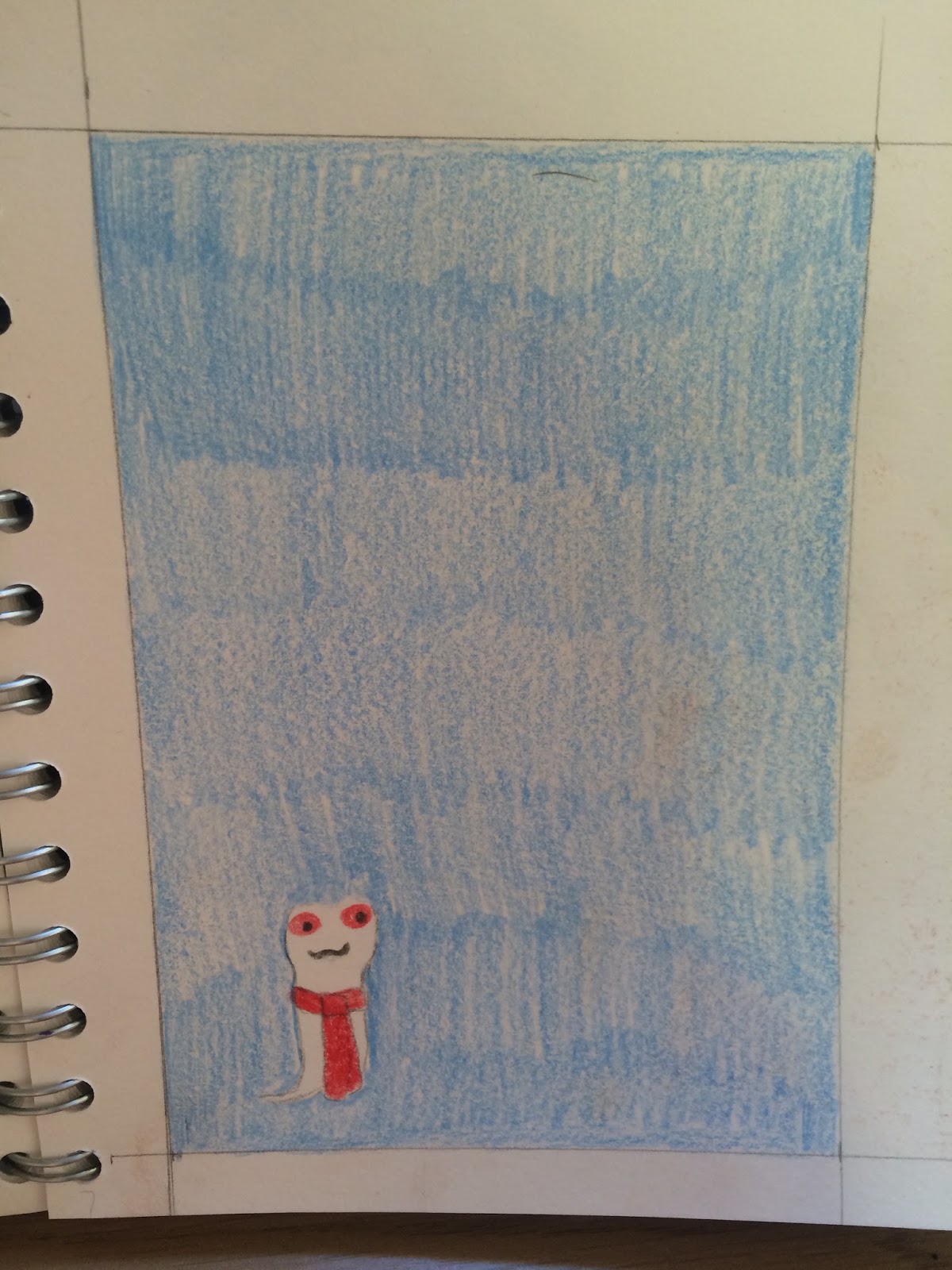
I was quite happy with this one. I moved the worm into the corner and made him tiny to emphasise on his size. It's also really simple with just negative space showing his face and the front of his body and then red for his eyes and scarf.
I think if I can get the other postcards to be visually similar to this then I might be onto something that looks pretty good.
|
All in all, i'm still really stuck with the postcards. I had it in my head that if I started small with the stamps and worked up the poster things might fall into place pretty easily, but now I'm seeing I should have started with the poster and go down in scale from there, taking bits from the poster to create other pieces of work.
I'm also debating whether it's going to be a good idea to screen print or not. I know that if I do I'm going to have limited time and it runs the risk of something going really wrong, like a screen not being washed out properly and things bleeding. I'm kind of tempted to print digitally but I don't think theres many (if any) booking slots left.


No comments:
Post a Comment